Sunday, May 10, 2009

Assignment 2 Part A: Final Creative Piece


'Memories' Synopsis


Animation and Motion Graphics is an introductory unit to a large and diverse industry, and focuses on selected elements within. This semester’s work therefore, has been directed towards educating students the techniques and skills required for a basic understanding and aptitude for this sub-genre of animation. As a previous Film and Television student who enjoys creative writing, it is unfortunate to note that narrative and character have not been explored throughout the semester’s projects. Therefore, for the final creative piece, I aim to include depth, character and story into my project. It is audio-driven; thus a good opportunity to construct a well-suited story.

My final piece is called ‘Memories’, and will be constructed around the tone and style of the audio track “Snowflakes” by Loveshadow. Composed of male vocals, piano, chimes, a slow tempo and lyrics about falling snowflakes, this song has a very simple melody, and is captivating despite its sad and eerie tone. The lyric ‘snowflakes’ will be used as a metaphor for memories. It will follow a lost spirit’s journey in retracing the events she has forgotten, leading up to her death. This particular audio was selected because its poetic lyrics are versatile in interpretation, and the melody fits well into my narrative writing style.

‘Memories’ is aimed at younger audiences who can relate to losing something or someone they hold dear. This audience should also have an appreciation for darker themes and storylines. Because the audio is licensed as Non-commercial Share-Alike, my resulting work must also fall under the same conditions. Upon completion, this project may be distributed on social networking sites and video sites such as Youtube, as a showcase of my abilities in motion graphics. The content and images of the piece will be a combination of Creative Commons content, and my own artwork created specifically for it. This will prevent future copyright issues.

Visually, ‘Memories’ will consist of harsh textures, flowing lines and snow scenery, as well as my own drawing style. I aim to achieve clean transitions between each memory using such lines and employing effective camera techniques. Grisalla’s Psyop Mtvhd is an example of how I wish to use the camera to direct the audience along the character’s journey. Additionally, I aim to express emotion and maintain a connection with the audio, as Robert Hodgin does with his video Magnetosphere. Magnetosphere is a captivating and visually fantastic clip which originally inspired me to construct an ambient piece. However, further knowledge is required regarding ambient techniques before attempting this, so I have selected a narrative project instead.

‘Memories’ is intended to be a dark, emotional journey which experiments with multiple layering and transitions. The moodboards included express the visual style and mood of the project. The majority of them are similar in colour and style with the exception of the fifth moodboard, which expresses emotions such as sadness, and can be representative of the character’s death.


Links:

Loveshadow’s ‘Snowflakes’: http://ccmixter.org/files/Loveshadow/19519

Grisalla’s ‘Psyop Mtvhd’: http://www.youtube.com/watch?v=rnyW3cMVmBA&feature=related

Robert Hodgin’s ‘Magnetosphere’:
http://www.dailymotion.com/user/flight404/video/x1qstx_magnetosphere-audio-by-trentemoller_creation


(1-6)

(1-3, 5, 7-10)

(2, 9, 11-13)

(2, 14-18)

(11-12, 19-23)


References

1. dark textures a work in progress #012 by sy parrish

2. Frost crystals on car window by net_efekt

3. Ghostly texture by ~Essence of a Dream~

4. Icy Snowflake Frost Fractal Photoshop Art Spheres by BL1961

5. Wall Texture by MattNJohnson

6. Lower-half Girl by Jessica Knight

7. abstract ornament by gpataque online portfolio

8. Snowflakes on Wood by CaptPiper

9. Snowy Fields by Still Burning

10. Hand by Jessica Knight

11. Free snowflakes falling at Night exture for layers Creative Commons by Pink Sherbet Photography

12. Ghostly winter by net_efekt

13. Girl by Jessica Knight

14. Free Desktop Background - 1600 - 1050 by pookado

15. Grungy by ~Essence of a Dream~

16. "I Love You" by Travis Gray

17. Project 365: February 8 by kurafire

18. Snowy field 2 by Muffet

19. Blue Eyes by Ali Smiles :)

20. Frozen heart by net_efekt

21. Green Paint Background by chefranden

22. Swirled by irisb477

23. Swirl texture by ~Essence of a Dream~

Video Copilot Exercise


Particles and Lines


We were advised to search through the Video Copilot website, which houses many tutorials for After Effects. At the time I was looking, I was interested in creating an ambient particle project for my final piece, and completed an exercise related to it.

The tutorial I watched ended up with a much smoother result than mine, but this may be because they incorporated a 3D composition into it. For basic particle movement, I feel this is an okay attempt, but needs fine tuning. The movement is mostly random and needs direction
. Alternative camera angles and zooms would make this interesting, as would change of colour and multiple lines. This is something to be explored in the future.

Week 8 Tutorial

Task: Augment the source video by corner pinning the supplied image within the video source file.


Corner Pinning


I found this exercise quite interesting but time consuming. Motion tracking is a valuable technique to learn, and can be used in quite a lot of scenarios. I think the end result is quite good for a first attempt, and I tried to go through all of the frames to fix the jumping image. However, I couldn't seem to perfect motion tracking, and I assume it is something to get used to and practice. Perhaps the image size and quality affected the outcome, as they were a little pixelated.

I am also interested in sorting out the image effects in After Effects. A few were applied to make the image appear to be on the screen, but this wasn't too successful as the black frame is there throughout. Had I spent more time on this exercise, I would have fiddled with the effects further, and finalised the motion tracking.

Week 6 Tutorial

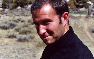
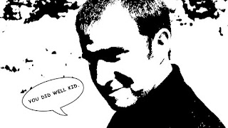
Task: Download an image of a person which is (a) licensed using Creative Commons, and (b) allows you to make derivative works. Stylize and adjust the image towards a darker, sinister tone as seen in the movie Sin City.


Sin City


I don't feel I was very successful with this exercise. The background should be black and there should be lines through it. I found experimenting with the Curves effect was frustrating at times, simply because it would do something I didn't intend. The 'Sin City' look or Threshold effect in general is one of my favourite effects in photo-editing. I would use Threshold than the Curves function, as it is easier to navigate. Had I spent more time on this, it would be more successful.

The image used above was obtained from Flickr: col014 by dorkvater.

Wednesday, April 29, 2009

What's On Your Radio?

http://vids.myspace.com/index.cfm?fuseaction=vids.individual&VideoID=1935523

This is one of my favourite film clips in the music industry. The song is 'What's On Your Radio?' by Australian band The Living End.

This film clip is fun and fast and employs an interesting use of techniques. It is depicted as an old, grainy film and makes reference to the early years of horror film and radio with its typography and inserted backgrounds and effects.

What I like about this clip is that it parodies an old style of film around fast, modern music. I think the quick camera movements are done (probably in post production) very well and it has a strong opening and ending. The electricity, radio waves and buildings are true to its genre.

This clip is an inspiration to me, showing you can mix opposites and still achieve a fantastic piece. If I delve into film clip making, this will be a reminder of effective aesthetics in film-work and post production.

I think there are a lot of films/music clips out there which try to parody the olden film genre and aren't quite successful. 'What's On Your Radio?' however, does achieve this effect exceptionally well, making it a humorous, light-hearted piece with a catchy rock tune.

A lot of The Living End's clips use background animation and graphics, such as 'Who's Gonna Save Us?' and 'Wake Up'. More clips can be found in the Media section on their website.

Tuesday, April 28, 2009

Assignment 1: Dexter Morgan


I included this project to compare how my skills are developing. Masking has been used a lot in this project, which can be suitable for Dexter's style. I'm quite comfortable using masking now, as it was included in this and the Stanthorpe Temporal Identity quite often. I am still getting used to animating objects, but this skill will develop over time.

The show Dexter has a strong style to it, and this was incorporated into the Identity. I feel there is movement lacking but have grown more comfortable with creating compositions in After Effects.

Week 5 Tutorial

Task: Develop a temporal and spatial composition within the constraints of a client brief.


Client Brief - Mad Mack's!


This exercise was fun yet incredibly annoying at the same time. As someone with a personal hatred for advertisements (particularly the 'crazy' ones), I didn't particularly wish to delve into this area. However, I did enjoy fiddling around with all the effects to see how ridiculously crazy the advertisement could get. The style is very close to this form of advertising, and the movement is suitable as well. If alterations were made, I would add more 'crazy' text, but wasn't quite sure how much I could stray from the client brief. Some matching audio would have made this easier to construct, but the effects were fairly simple to begin with.